How to make your display of mass-produced products into a work of art.
How to make your display of mass-produced products into a work of art.
People want hand-crafted things, don’t they? They want things that are unique. They want to avoid thinking of the factory. Mass production isn’t romantic or pretty.
So why were people transfixed by Andy Warhol’s paintings & screenprints of Campbell’s Soup, which show an array of near-identical cans, varying only in tiny details? It’s just soup. But it’s also pop art, in which viewers were surprised & delighted by artists’ attention to the repetitive yet often beautifully-designed objects that make up real life. The special power of pop art is to make you look at familiar objects in a new way.
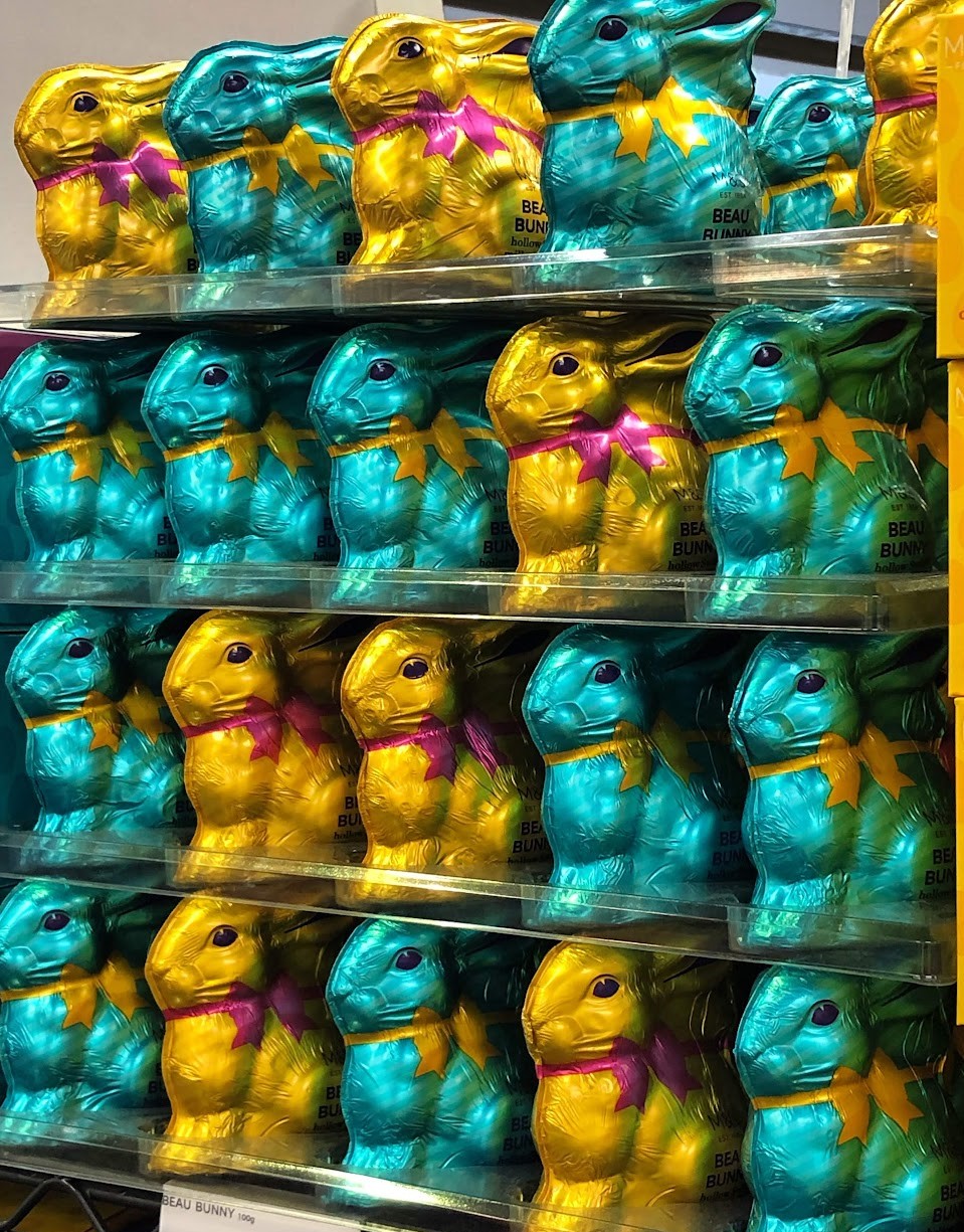
Now look these chocolate bunnies, it’s a display in M&S. I snapped it in 2019, recognising it as special. The bunnies are as repetitive as cans of soup. There’s even less variation, because these bunnies only come in two colours. What makes this display so compelling?
– A novel spectacle. That’s the first time I’ve seen an army of gold and blue rabbits on parade, smartly decked out in their uniforms. When am I going to see this exact thing again? Probably never. People are attuned to novelty, they know when they are seeing something new.
– Shiny! It’s no secret that people, like magpies, are drawn to shiny things. We have to cultivate a taste for matte surfaces. Shiny things are appealing right away.
– Look at that tightly restricted colour palette. On the one hand, searingly vivid. On the other hand, there are only four colours: gold, blue, pink and small amounts of black. LESS IS MORE. This is important. The bunnies don’t need to be every colour. Yes, these colours are bright, but there are so few of them that we are invited to really concentrate on and appreciate the gold, blue and pink.
– Visual interest is added by mixing up the bunnies in their rows. Yes, the bunnies are substantially the same. But no two rows are the same. I felt as though I were looking at a modernist artwork by Barnett Newman or Donald Judd (links in the comments), where the point is to show that moving a straight line a few inches to the left, or slightly increasing the space between objects alters a visual message.
– If you look very closely, you can see that, just like Warhol’s soup cans, the bunnies aren’t all the same. Like his paintings or like our fingerprints, the wrinkles in the skin of each bunny are different from one to the next. Their uniqueness was waiting to be revealed.
– The completeness of the display is immersive, almost overwhelming. It’s wall-to-wall bunnies. There are just two empty spaces on the top row. I was aching to ask someone to fill the gaps but I wasn’t sure they’d understand why I was asking 😁
More semiotics: “Using Semiotics in Retail” (2023), available worldwide. This book won an award.
#semiotics #packaging #art #design #confectionery #retail #shoppermarketing #colour #MarksandSpencer
Kogan Page, Market Research Society (MRS), Lawes Consulting Ltd, Dr Rachel Lawes, Joe Lawes
© 2021 Lawes Consulting. All rights reserved.
Website By the Scruff
0 Comments