BOOST YOUR BRAND’S SUCCESS BY CHOOSING THE RIGHT TYPEFACE

Which typeface should you choose for your brand? Should you get one custom-designed? Will your customers know what you are trying to say?
Your customers draw conclusions from typefaces – so your choice can make or break your brand. Semiotics empowers you to use typefaces to your best advantage and choose the ones that people will want to pay for. Let’s learn from a case study: Ben & Jerry’s ice cream, one of Unilever’s best-loved brands.
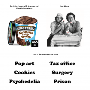
Perhaps its most distinctive asset is its typeface – or, in fact, two typefaces if you look carefully. They were handmade by award-winning designer Lyn Severance.
There’s much to be said in favour of brands using custom typefaces that they can fully own. Once consumers have learned to recognise it, it becomes a powerful brand asset. But if consumers are looking at a new typeface, how do they decide what it means?
Consumers and shoppers look at the details and ask themselves ‘Where have I seen this before?’
Consumers can understand Severance and Chunk Style because they remind them of famous typefaces like Cooper Black. Cooper Black is linked to 60s pop culture and is loaded with meaning. Thanks to the way it’s been used over the years, it’s come to mean cheeky, fun-loving and cool.
Look at the table of words. See how the list of words in the left column ‘look good’ in Cooper Black, but the ones in the right column feel awkward? Would you feel confident in the cutting-edge technology of the surgery or the security of the prison?
That’s semiotics in action. People draw interpretations based on ‘what they’ve seen before’. With Severance and Chunk Style, Ben & Jerry’s benefits from owning an exclusive typeface, *and* from the halo effect from Cooper Black.
Semiotics exists to show you how this stuff works.
This case study and many more appear in “Using Semiotic in Retail: Leverage consumer insight to engage shoppers and boost sales”. Available worldwide on Amazon, publisher koganpage.com and all good bookstores.
#cooperblack #popart #semiotics #font #typeface #consumerinsight #qualitativeresearch #retail #fmcg #design
Market Research Society (MRS), Kogan Page Marketing & Communications, Unilever
© 2021 Lawes Consulting. All rights reserved.
Website By the Scruff

0 Comments